By now many of you have probably seen the Daily Cal photos and slideshows, as well as the election issue front cover. Election night was an all streetlamp-lit night photography affair, which is pretty much the pinnacle of low-light difficulty (unless you were to cover news by moonlight, I suppose). Combined with all of the fast-paced action, it made for one of the more challenging shoots in my favorite specialty area.

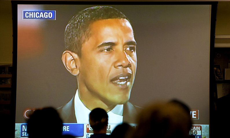
Members of the public watch a broadcast of Senator Barack Obama's victory speech at the IGS Library in Moses Hall
Part 1: Results Viewing at Moses Hall
I had classes throughout the day on Tuesday, so the first event I caught was the viewing party for members of the public (mostly Cal Dems) at the Institute of Government Studies (IGS) at Moses Hall. There was a large screen set up inside the IGS library, where a crowd of mostly tepid adults were watching. I stayed here for a few minutes, but it quickly became apparent that this was probably the least energetic group of election results viewers in the entire city – the entire crowd sat throughout the broadcast in absolutely silence, without a single cheer or handclap as each of the states in the presidential race were called. Meanwhile, the group of students watching under an outdoor tent set up in the courtyard between Moses and Stephens Hall were letting out whoops and hollers that could be heard through the windows, so I decided to head out there in hopes of catching a little more enthusiasm.
Usually, outdoor streetlights are bad enough, since they’re usually old and emit a heavily off-white yellow color, and aren’t bright enough to light anything adequately. Making matters worse, the organizers had pitched up a tent which blocked off what little light the streetlamps gave, leaving the faint projector light reflected off a screen as the predominant source of illumination in the room.

Cal Dems viewing tent outside Moses Hall
Even throwing aside all the issues with blurry long exposures and noisy high-ISOs, your typical “natural light” photo here would look atrocious due to the quality of light given. Issue 1 is the terrible contrast between the fairly neutral white light emitted by the projector, and the distinctly yellow glow of the rest of the scene that was illuminated by the surrounding street lamps. With a single light source type emitting a certain color of light, color-balancing a RAW file will do the trick, but this is impossible with multiple light sources. In this case, we’re either stuck with a photo like this, or a photo balanced for the surrounding yellow areas, which would leave the projector screen and the subjects next to it unnaturally blue.
Issue 2 is the large dynamic range in this image, which goes from a detail-less bright white screen to detail-less blacks in the shadow areas.
Given these issues, I chose a spot on the left side of the projector screen, focusing mostly on the few people sitting in the front row.

Front row, from standing chest level height
Taking the projector screen out of the photo, the worst of the dynamic range issues disappear. We still have problems with crushed shadows, but no highlights are “blown out”, and the most important elements – people’s faces, or perhaps the flags – are correctly exposed and perfectly visible.
This photo was taken at about chest level, which is still high up enough to see most of the background. While background elements are usually nice for context, in this case it’s somewhat hurting the photo because the back is a lot darker and less detailed (on account of our primary light source, the projector screen, illuminating the front row only). The background is also mostly illuminated by light from the surrounding yellow lamps, strongly clashing with the neutral white light from the projector screen.
To solve this, I ended up taking most photos while sitting/kneeling to achieve a lower vantage point. This gives a slight perspective difference and makes your subjects appear bigger, but more importantly removes the dim 3rd row+ crowd and most of the ugly yellow background and replaces it with the nice, fairly neutral white tent ceiling. The effect is a cleaner photo with no ugly distractions, allowing viewers to focus attention on the front row people and their reactions/expressions.

Front row, waist-level height
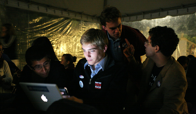
While taking these shots I also noticed the light emanating from the laptop of the fellow on the left, which provided another interesting light source to take advantage of:

Laptop light source

Laptop light source

Laptop light source
After spending some time taking these natural light photos, I decided to try busting out the flash. Typically flash doesn’t work so well in outdoor nighttime environments, since there’s no practical surface to bounce off of, and direct flash (even the sto-fen “diffused” kind) will black out any background beyond a couple of meters (think your typical flash party pictures), providing no context for whatever primary subjects are in the front.
Since we were under a tent (see first image) with a white canopy, there *was* an actual ceiling to bounce off of. While this worked to illuminate the room, it did so too well – the whole scene looked like it was taken indoors or in daylight, with a bright-white ceiling. I’ve actually deleted all of the ceiling bounce photos, but they looked something like this, which is to say not like a dark outdoor tent whatsoever.

This flash was actually bounced behind me at a slightly upward angle. A direct ceiling bounce looked far worse (somewhat like this, but with a lot less fill)
Obviously this wasn’t going to work, and I thought I’d be stuck with ambient lighting for the night. Fortunately though, the tent wasn’t exactly an open-air tent – it was encased with a transparent plastic curtain.

The mostly transparent but somewhat reflective plastic curtain
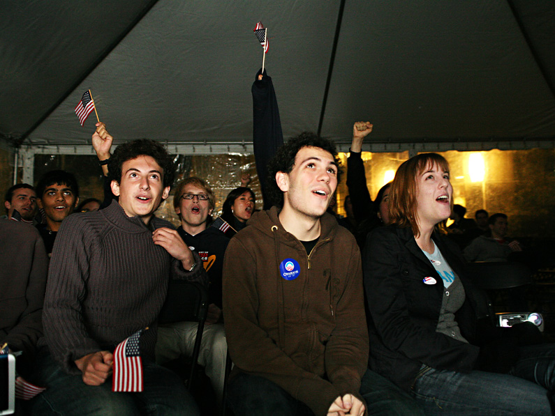
Obviously a sheet of see-through plastic is not the most ideal surface for bouncing, but it was just enough to do the trick here, at about 1/4 flash power on my Sigma EF-500 DG Super (GN 165ft) with ISO1600 and f/2.8. I angled the flash to fire backwards, reflecting off the back curtain and illuminating the people in the front.

Diffused direct flash

Diffused direct flash
So the moral of the story here is, explore your scene and get creative with your light sources. In low-light conditions, chances are that the lighting given is going to be crappy – there is very little you’re going to be able to do to capture the entire scene (in this case, the entire room of viewers) with sufficient quality.
Looking for isolated subjects that are particularly illuminated by a light source is a good start – in this case it was taking only the front row of students who were illuminated by the projector screen, and later it was the handful of people huddled around a laptop. Sure, focusing on such a select group doesn’t adequately “tell the whole story”, but then again the single photo that usually runs in a paper never does.
Bringing a flash with you opens up far more options. Pop-up or embedded flashes are useful mostly as a last-resort tool, when there’s no possible ISO/shutter/aperture combination that will give you a sufficient exposure and acceptable blur. With an external flash that’s capable of swiveling, however, nearly anything in your immediate proximity can be turned into a light source. It’s still a good idea to have a relatively dialed-down flash output, and a longer shutter to include more ambient light – this gives you most of the positive effects flash can offer – sufficient illumination, frozen motion – while still preserving the overall mood of the ambient light (both of the final images still look like they were taken in a dark tent, rather than a bright indoor room, like the ceiling bounce photo).
The two things you want to keep in mind when choosing a surface to be your new light “source” via bounce are direction and surface area. Surface area is of course going to determine the level of diffusion – the larger the surface area, the softer and more diffuse light will be (generally a good thing). This is perhaps the primary factor in producing a pleasing flash effect rather than an atrocious one. Despite having flash come from a directly forward direction like a typical direct flash, the two photos above still appear pleasing, primarily because that light was reflected over a much larger area on the plastic curtain first.
Direction has much more to do with the “feel” of the lighting, and typically if you want to preserve a similar feel to the ambient lighting, you want the direction of the light source to match that of ambient lighting. This is why most indoor events will see light bounced off of the ceiling, emulating ceiling lights. And light bounced off the floor looks like campfire lighting. And sidewall-bounced light never looks realistic. In my case, the light was bounced from behind me, which was where light from the outside streetlamps was entering anyway.
That about wraps up the photos from the results viewing party. If you were wondering, the last photo was the one chosen for publication, otensibly because of the expression/reactions that I had no part of, but I like to think because of good technical lighting quality. Next post I’ll talk about the ensuing craziness in the Berkeley streets and the photos for that, including the eventual Daily Cal front cover. If you’ve got any other questions about the shots above, or the thought process through the assignment, feel free to post it in the comments.
Tags: Barack Obama, bounce flash, Daily Cal, election 2008, election night, low-light photography, making the shot, obama victory speech, photography, photojournalism, The Daily Californian, united states presidential election


[…] out on assignment to cover events or subjects you’d never hear or think of (like, admittedly, 2008 election night results party and aftermath), or never have access to (like getting close enough to touch Natalie Portman!), which in the long […]
Damn, Nathan, you’re just too good at this stuff! So much knowledge!